Fiona
This is mesmerizing; the intricacy in the layering is so ornate and explosive that it makes you wonder what fabrics were used. The colours are illuminating and crisp, reminds me exactly of the video. I am impressed by this design. I love the orange shorts, I would have perhaps nixed the belt but overall this is cohesive and fresh. Thanks.
Pandorahacked

Calum
There is too much black swallowing this outfit up. The same bee symbol design on the top is replicated from last week; I would overlook it if the outfit itself wasn’t so detached from the music video. I think your layout is good, and you’ve always shown as you can do that - however this doesn’t leave a lasting impression on me. Honestly my main problem is the use of a huge mass of black colour; it’s too much for such a bright and colourful video.
Conclusion
Congratulations Barbuda. You've managed to inspire us once again this week; claiming your second win of the season. Kudos on your efforts. This week we say goodbye to 2 designers in a shocking double elimination. Though the odds were stacked against them this week; they are both very talented and have shown us only a fraction of what they can do. Rotisary and Issus; you will be missed. Thanks everyone.
Welcome to Week 4 designers. This week we are bringing back a fan favourite task. Listed below are 4 inspiring music videos. Using your creativity and discretion, design an appropriate outfit that would prompt the theme and creative style of the video you have chosen. Click the buttons below the titles to see the video. Good luck designers.
Stay Awhile
She & Him

What I Want
Will Butler
Shape
Glasser

Slip Away
Perfume Genius
Video Ga Ga

PHOTOSHOOT
Xigma

Fiona
Though i'm not particularly fascinated with the use of the apron in this design, I see how it relates to the video and in relation to the rest of your creation. The artistry and construction of the layers under the apron are tremendous. It's almost as though the colours are dripping off of you. Very ingenious. The soft colour palette mocks that of the music video; and I commend you on designing a complete design. Thanks.
Calum
I am a little underwhelmed with this outfit in regards to your previous two stellar designs. However I do enjoy parts of this. The obscure linear pattern you constructed below the apron looks gorgeous and reflects the geometry of the video. Its controlled yet on the verge of chaos, which again in turn really compliments the video choice. The top half of your outfit is weaker in comparison with such a strong bottom half. The apron overwhelms this design especially with such a vast use of baby pink. Overall this is a good design, with some faults bringing it down.

Blackmama1.4

Fiona
This is aesthetically your best design thus far. I love the vivacious colours and the way you incorporated them throughout this as a whole. The belt broke the design up in a way that made me appreciate both the top and bottom separately, then all together. The waist is my favourite part of this, the way the dotted effect from the top meshes with the belt and the geometric patterns of the skirt is exquisite. Thanks.
Calum
Blue and red seemed to be the obvious colour pallet of choice for this video. Which I am perfectly okay with, but I don't see anything particularly amazing with this design - especially in correlation with the video. I like the use of geometry but this video has a odd mayhem to it in which I'd expect a more erratic use of pattern. I don't hate the design; you've balanced your colours perfectly and the pink streak in the shoes was a nice touch, but I feel like i've come to expect a design like this from you. Simplicity wasn't the best option - so I'm left underwhelmed.
Rotisary

Fiona
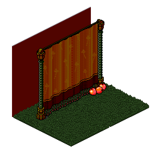
I don't love this. I saw the inspiration in the video which was appropriate; it's just the layering and fabrics used are very amateur. The draping effect is in theory a smart design choice, and it matches the curtains in the music video; however execution wasn't there for me. I feel as though I'm left wanting more; underwhelmed. The most satisfying component of this design for me would be the head accessories; the swirl of colours they hold in the earrings catch my attention. I don't think that will be enough to save you this week though. Thankyou.
Calum
Anyone would know I love Perfume Genius and this song / video - I know it inside out, and I don't dislike this as much as Fiona, but it does edge on average. I can see your inspirations: the draping effect to match the silk curtains, the delicate headpiece to soft pallet to replicate the sky. However doing this outfit from a rear angle has done you zero favours. The angle you've chosen makes the outfit look boxy and compact even with the draping effect. I appreciate the delicacy of this outfit but it falls flat for me.
Issus

Fiona
I wish you had approached this differently; it seems as though you were so set on doing a backwards design that you negated from the focus of the task. I see aspects of design and aesthetics that match that of the video but in retrospect this is so simple and bland that the result is sub par. The use of the pants with the shoes were my favourite part of this creation. I don't like how straight-edge this design seems, I think adding twists and turns would have worked wonders. This approach was far too conservative, it would have been nice to see some sort of complex risk. Thanks.


Barbuda

Fiona
This is an amazing use of fabrics, I've never seen the vest contorted in such a creative way before; the depth and layers this embodies is glorious. The sporadic movement in the video is transcribed quite well in your design. I love the colours and the black, you're giving us fresh looks. I'm enthused by this. Thanks.
Calum
You are really killing it in regards to fitting into the mould of each task this time around. I see you also opted to use the red / blue / black foundation. Conceptually, I think you nailed the video. The irregular chest design almost looks like a bulletproof vest - which I really like. Not a big fan of the shoe choice or the earrings - as they overwhelm the design. I'd maybe like to see you step out of your comfort zone a little, I see a lot of structural and symmetrical outfits from you so it would be nice to see. But this is on par with the video and I can't fault you for that, another good job this week.
Xenid
Fiona
Though I feel as though i've seen aspects of this design before, it mends well with the theme and creative movements this video has to offer. Very subtle approach on bringing the video to life. I think it's important to show variety when designing, as well as balancing the features and fabrics. The smooth yet ruffled bottom balances well with the top and it works. I especially enjoy the shoes. Safe design this week.
Calum
This is a very subtle outfit in terms of colour, compared to a video that is vivacious and filled with picturesque scenery. The dancer in the video does wear a white dress, however I don't think the white works for this. I love the ruffles and the replicated effect on the skirt, and the pop of that vibrant plum colour on the shoes is a nice ode to this particular video. Honestly I like most of this, it's just the white that pulls this outfit away from me loving it completely.

Fiona
I'm most impressed by the small intricate details throughout this layout; thought it appears to be minimal there are so many small specks of patterns that draw my attention. Much like the video, I think this twist illusion in the scarf is brilliant. I would have liked to see maybe a black or a colour to break up some of the aesthetics but overall I think this is safe. I like how smooth the hat looks with the use of the shirt. I think this is pleasant to look at.
Calum
I'll say this off the bat: I hate that grainy effect from the scarf and the skirt. However I like the some other elements of this outfit. The all-encapsulating grey really reflects the odd watery effects of this video, and I think the scarf does it's part too. Your layering this week and colour choice is definitely your strongest asset. But this outfit also lacks something - I feel like I have seen it on you before (which I most definitely have). I think it's a job well done, for the most part.

Kushmas
Fiona
The colour palette is exhilarating this week, very fresh and palpable. I love the use of the orange mixed with the beige. In relation to the fabrics used, they lacked for me. The capris are boring, I think something boxier would have played better with the top half of the design; perhaps a long skirt. The use of the headband is unnecessary in my opinion. I think there are a few nice details about this design, but i'm left with a higher desire for something more. Thanks.
Calum
This outfit really doesn't work for me. The abrasive textures of the denim jacket and the colour palette just put it off. This disjointed shoulder pattern is very popular this week, and I'm not a fan in most cases. I do like the gradation detail but I just wish this was more connected to the video. It's alright, just not enough.

Snawl
Fiona
Your attention to detail is astonishing, you captivated the charm and simplicity the video had to offer. From the fine details in the background as well as supporting characters in the video itself; it all ended up in your design. Very admirable. The jacket has been done before; and although it works with this particular design, I think it's time for some new tricks. The grey bodice is beautifully crafted and embodies what I was looking for this week. I wish you had added a blue shoe, that's paying homage to the main piece of the video. This is a solid work of artistry. Thanks.
Calum
I see why you chose this palette in terms with the video you chose, however I wish you could show us more diversity in terms of colour. I think the pure grey, linear dress underneath the shawl really gives off a domestica-suburban vibe that really clicks with the video. I just wish it clicked with me more, the outfit is a little lackluster if I’m honest. It is simple and to the point, however - perhaps that’s what you were going for. The glasses were also a neat touch. I just want to see more.
Calum
I can relate this outfit to the video; and I understand what you were trying to convey this week - but I have my issues with the back facing. I think showing this outfit from the back wasn't the best option for the design you've made. It doesn't really elevate it or give me something different except the hood. Plus I really don't like the bright blue. However i do like how bulky this outfit looks, as the video is heavily inspired by architecture and motion I really think you depicted it beautifully in regards to layout, and I love the baby blue and beige together. I think you've done a good job this week but I think it was marred a little by the choice of angle.
Icearbr
Jozinga

Calum
I really like this outfit. It oozes vibrancy and has a sort of urgency I love - parallel to the video of two flamboyant beings on the run. Everything about this look is dramatic, the flame top and the bright orange colours. It’s very romantic and passionate, which Is present in the video. I don’t like the gun belt, however the rest is well composed. Good job this week.
That's it for Week 4 designers. We shocked the system with a surprise double elimination! Good designs this week; a lot of passion. The competition is speeding up as each week progresses; don't be left behind.
DOUBLE ELIMINATION
Fiona
My favourite thing about this design is the use of the textures in the vest, belt, and skirt. They really blend well and create a unified design. The colours could be lighter, maybe adding lighter shades of brown and green would have played better with the theme of the video; and perhaps overlook some of the dark you used in this design. The cutout in the vest adds an interesting appeal to this. Overall, a safe design this week.